Dwelling Place
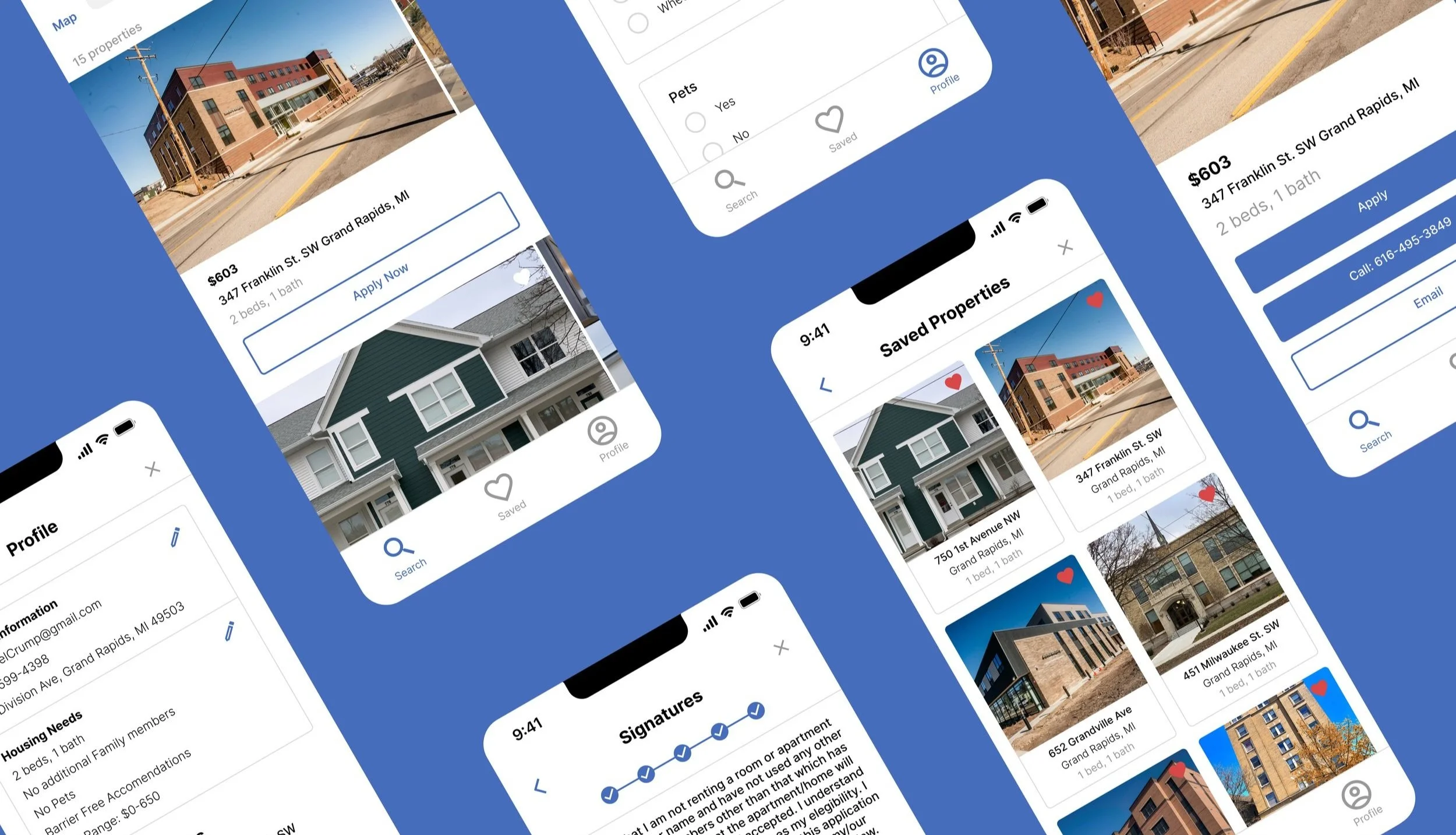
A low-income housing application that allows users to easily apply and check the status of housing opportunities.
Role: UX/UI Designer
Duration: August - October 2022
“Dwelling Place improves the lives of people by creating quality affordable housing, providing essential support services, and serving as a catalyst for neighborhood revitalization.”
Problem
Dwelling place aims to help find affordable housing for residents of Grand Rapids. The process is antiquated and difficult. Dwelling place applicants must apply individually for each housing opportunity and must fill out a physical application that needs to be mailed in.
Solution
The new application allows users to easily apply for multiple properties at a time, check the status of their application, and be notified of all updates in the process. The form is completely digital and only has to be filled out once. The application is streamlined and accessible to all users.
Process
Research
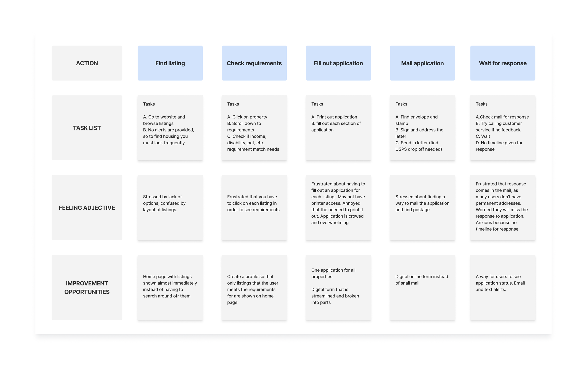
I started my research by surveying users and caseworkers who use the current website and application system at Dwelling Place. I had users go through the current process of applying for a property from start to finish and asked them to describe their emotions and feelings along the way. After conducting multiple interviews using the current application system I came up with a basic user journey.
Current User Journey
Insights
Universal application for all properties in the dwelling place network
Caseworker approval settings for those who need it
New housing alerts via email or text
Ability to check housing application status
Completely Online Application process
Proposed User Journey
Design
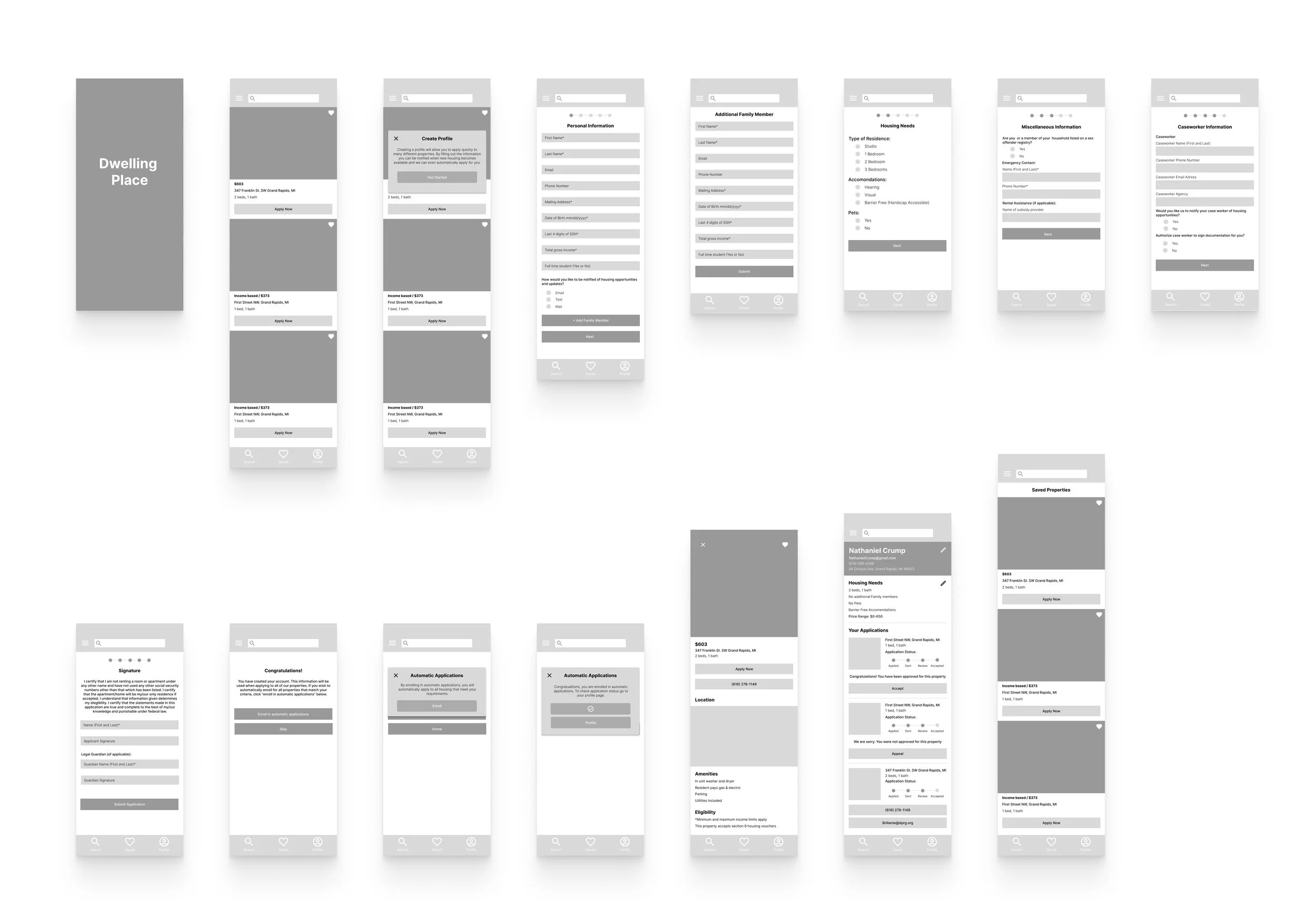
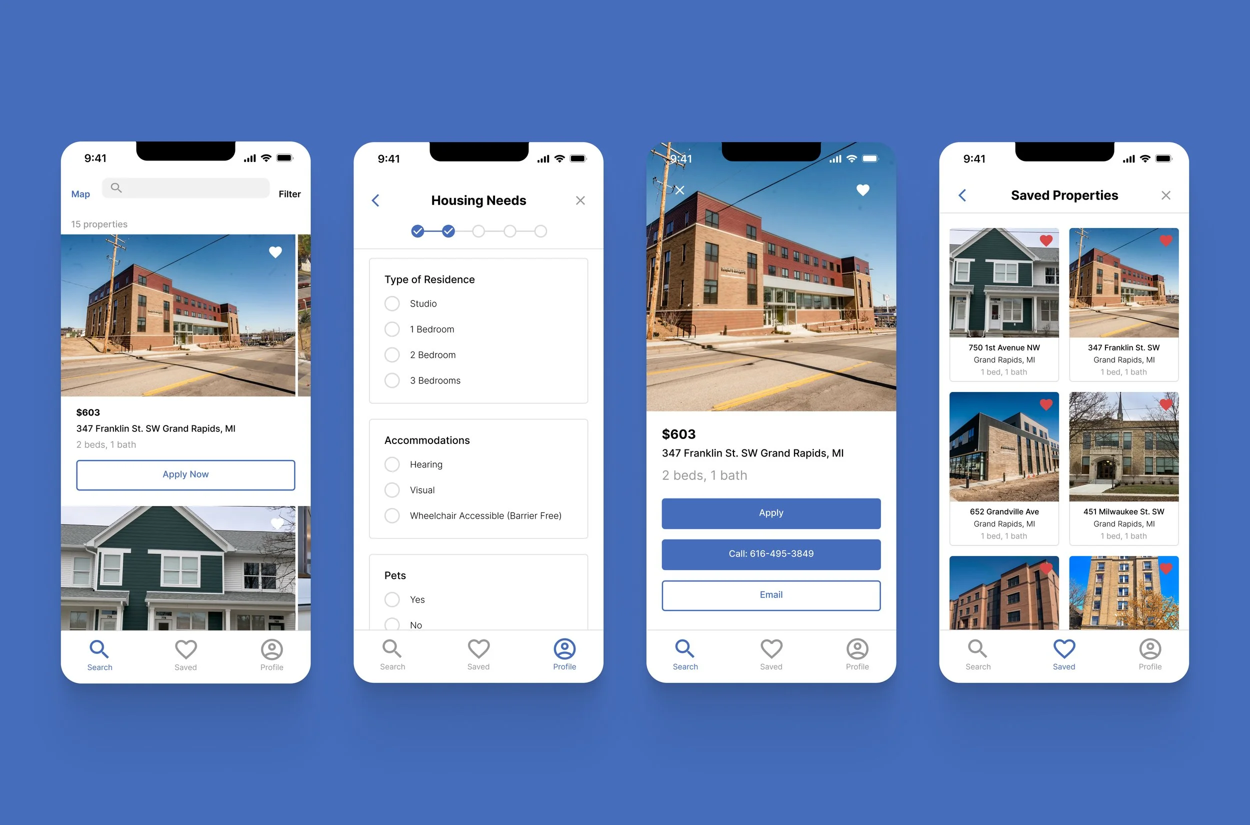
Using these insights, and following the new proposed user journey, I began to wireframe and design low-fidelity mockups for the application. The application would involve a homepage with available properties, saved properties, and a user account page. When the application opens, users would be prompted to create an account for easier application. After testing the low-fidelity prototype, I continued to iterate high-fidelity mockups and a prototype for the application.
Low-fidelity Mockups
High-fidelity Mockups
Prototype
Iterations
Streamlined Form
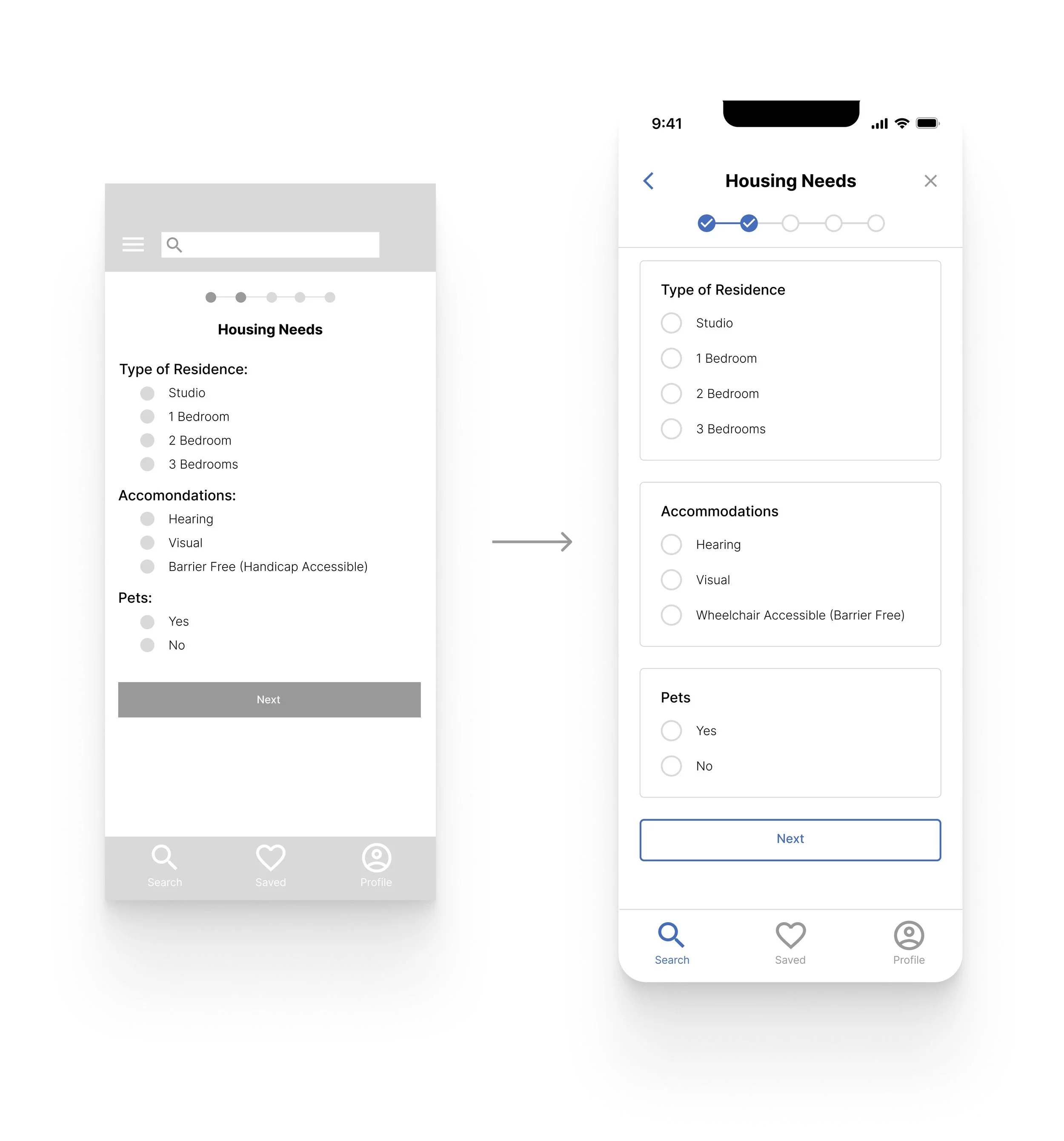
Based on the initial testing of the low-fidelity prototype, I found that the mockups were crowded and the forms needed to be more visually separated. One of the main insights of my research was the stressful nature of the original application. It was long and crowded and deterred many users. The initial mockups were better, but the visual separation on the final mockups as well as the spacing really gave the forms a more streamlined and user-friendly flow.
Options to skip
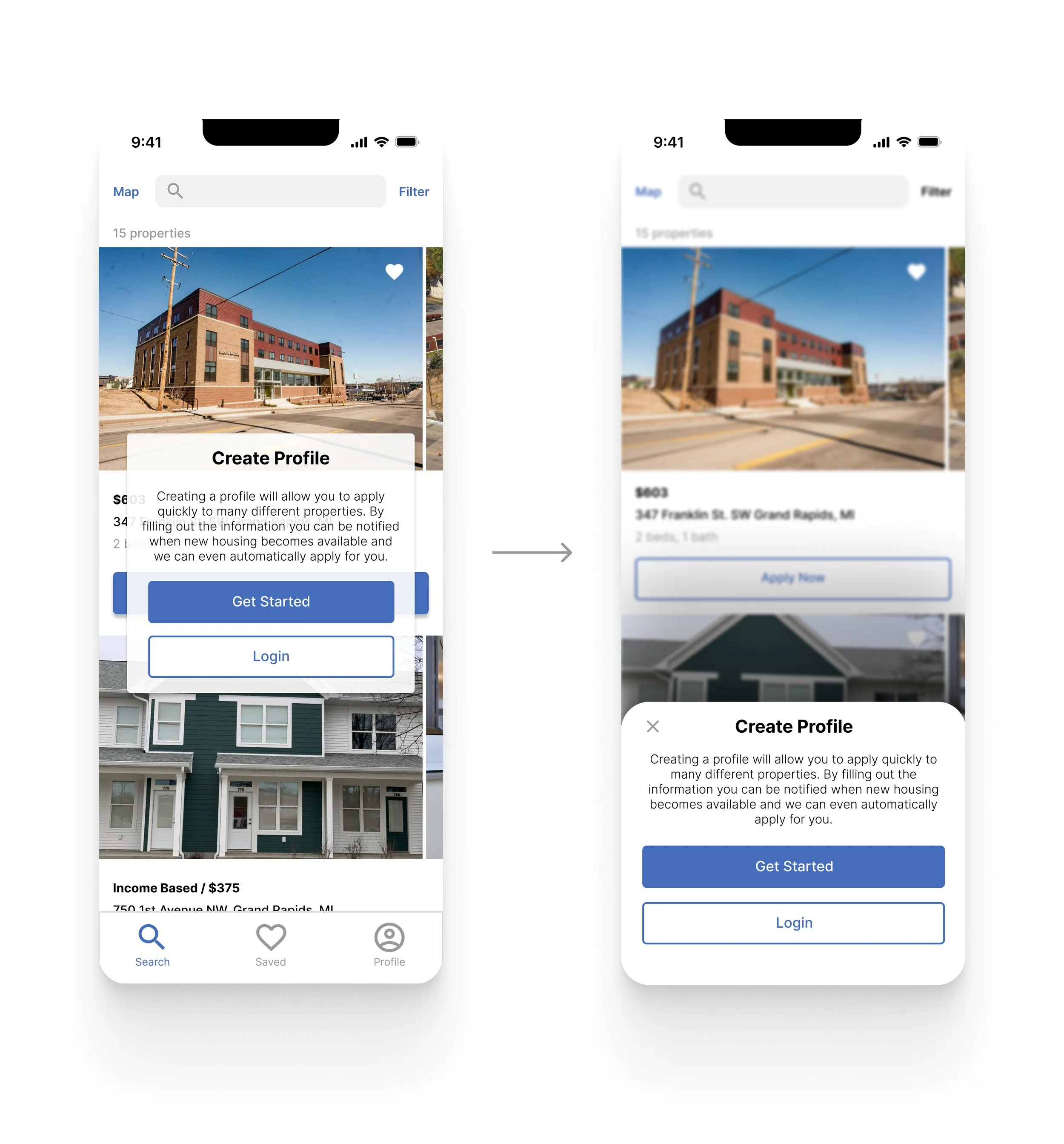
The initial user flow forced users to create a profile immediately with no option to skip. For some users, this was a frustration. Some wanted to simply browse properties and see what was available before making a profile. The profile function was made to make the application easier, but not all users want to apply right away. I also switched the modal style to the bottom of the screen while also giving the user the option to exit.
Conclusion
Through the design process and completion of this application, I learned the importance of understanding the user. In this particular case, many users didn’t have access to mailboxes consistently. Many were homeless and relied heavily on their caseworkers for help with finding housing. The previous system was inaccessible to the target user. Understanding this took interviewing both caseworkers and low-income applicants.
Hopefully with this new application residents in Grand Rapids looking for affordable housing will have a better chance of finding housing that matches their needs.
